SH #3: Understanding Galaxies         Group Project

Team A:       The populations of galaxies detected by ALFALFA and by SDSS

The task of your team is to explore the differences in the populations of galaxies detected by the two surveys: ALFALFA and the SDSS. Note that here we use only a subset of the full ALFALFA dataset (smaller files: less work).

Specifically, you will construct a color-magnitude diagram for the galaxies included in the 2011 ALFALFA data release (Haynes et al 2011) using colors and magnitudes derived from the Sloan Digital Sky Survey (SDSS). We will provide you with all the data you need, but you'll have to try to understand some of what we have done to get the data ready to use. Keep in mind that the ultimate goal is for the team to present your results Wednesday evening. You will need to explain everything that you have done, all the assumptions you have made and what uncertainties remain.


The astronomical rainbow particularly as viewed by the SDSS

  •   Remind yourself of the meaning of the terms magnitude, color index, extinction and other relevant quantities.


  •   To the right is the diagram showing the wavelength response of the five SDSS filters. Which one is g? which is i?


  •   In a very famous movie, what would be the (g-i) color index of Mary Kate Danaher's hair?


  •   Explain why lower values of the (g-i) color index indicate bluer galaxies.


  • Credit: SDSS


    Star forming galaxies have a healthy interstellar medium

    Using the Arecibo telescope, ALFALFA detects the cool hydrogen gas (HI) in and around galaxies in the local universe. While stars in galaxies like the Milky Way form from the very cold clouds of molecular gas, most galaxies contain a lot more hydrogen in the form of diffuse cool atomic gas. Atomic hydrogen then is one step removed from the star formation process, but its abundance in a galaxy is a good metric of the fertility of the galaxy to make stars in the future. Hence, ALFALFA aims to take a robust census of atomic hydrogen gas bearing galaxies in the local universe and to explore how the gas content relates to the stellar population in those galaxies and how variations in gas content reflect difference in galaxy environment. Someday, when the Square Kilometre Array is built, our students and their students will study how the hydrogen content of galaxies has changed over cosmic time. Today we have more modest goals: here, we will use the ALFALFA and SDSS datasets to compare the populations of galaxies detected by the two surveys.

  •   What is the typical temperature of a cool interstellar cloud in which the hydrogen is mainly neutral (atomic)?


  •   What is the typical temperature of a cold interstellar cloud in which the hydrogen is mainly molecular?


  •   What is the typical temperature of a ionized HII region?


    A color magnitude diagram of SDSS galaxies in the Coma supercluster

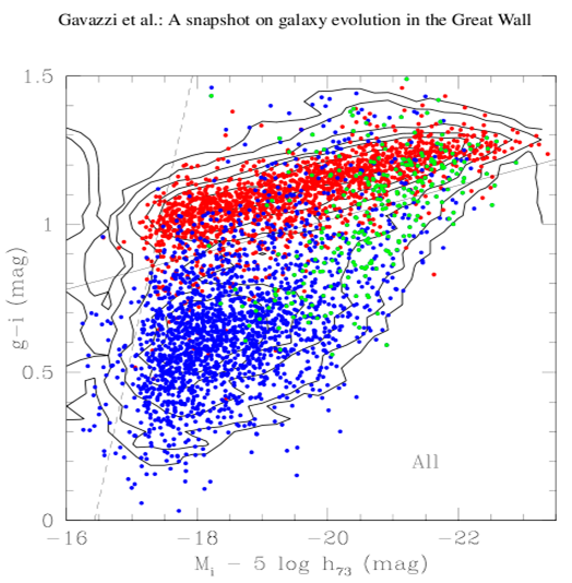
    A common way to explore the properties of a population of galaxies involves constructing its color-magnitude diagram (CMD). Such a diagram shows that most galaxies inhabit one of two main regions on the diagram: the "red sequence" and the "blue cloud". A nice example which we will use for reference is the work of ALFALFA team member Peppo Gavazzi and his co-workers who constructed the CMD of a large sample of galaxies within 420 square degrees of sky covering the Coma supercluster and its member groups and clusters of galaxies as presented in Gavazzi et al (2010), A&A 517, 73.

    Taken from Fig. 3 of that paper, the figure shows the "g-i color versus i-band absolute magnitude relation of all galaxies in the C[oma]S[upercluster] coded according to Hubble type: red = early- type galaxies (dE-E-S0-S0a); blue = disk galaxies (Sbc-Im-BCD); green = bulge galaxies (Sa-Sb)... Contours of equal density are given. The continuum line g-i = -0.0585 *(Mi + 16) + 0.78 represents the empirical separation between the red-sequence and the remaining galaxies. The dashed line illustrates the effect of the limiting magnitude r=17.77 of the spectroscopic SDSS database, combined with the color of the faintest E galaxies g-i ~0.70 mag.."

  • Be sure you understand this diagram and what it tells us about galaxies.


  • Figure 3 from Gavazzi et al (2010)

  • Compare this diagram to the one you made in SH #1. In what ways is it different/similar?


    The ALFALFA α.40 dataset:

    The ALFALFA catalog data are available either as part of the publication in the Astronomical Journal or from our own data products page. It is now standard practice in astronomy to provide data for use by others in standard formats such as "CSV", so we have done that. Note that this is the same file you used in the SH#1 activity.

  •   If you haven't already, download the file in CSV format or ASCII text format and then use TOPCAT to generate the plots.

    Be sure you also know where to find the final (α.100) dataset....

    Distance bias:

    First, let's examine how the HI masses of galaxies detected by ALFALFA differ as we move from the very nearby galaxies to more distant ones. Use TOPCAT to make the plot of Distance (horizontal axis) versus log HI mass. This type of plot is called a Spanhauer diagram.

  •   What are your impressions of this plot?


  •   There are two "gaps" (fewer than expected) at distances of about 85 Mpc and 230 Mpc. For the HI 21 cm line, what frequencies do these gaps correspond to? Any ideas on what causes the gaps?


  •   There appears to be a vertical line-up of (more than expected) points at a distance of 17 Mpc. What might cause this?


  •   Why does the distribution of points appear as it does? Why is it important to keep this diagram in mind as we explore galaxies detected by ALFALFA?


    SDSS data for the α.40 galaxies
    Find here the file in CSV format or ASCII text format containing useful information extracted from the population of galaxies included in both the 2011 public ALFALFA survey catalog (α.40 Haynes et al (2011)) and the SDSS DR7 database.

    Examine the contents of the file before you start working with it and be sure that you understand what all the columns mean; if you don't understand any of them, ask. Note that (1) there is a lot more here than you actually need (but we want you to try to understand more than the minimum) and (2) we are deliberately not telling you what everything is so you'll have to try to figure it out (and, of course, you can ask for help). For example, in practice, to calculate colors, you need to correct the observed apparent magnitudes at both bands for Galactic and internal extinction; those corrections are given in the table. See if you can figure out what the table contains.

  •   While you might think that it would be easy to measure all the light, and hence the magnitude, it turns out that it's easier said than done, because the outer regions of the galaxy are fainter than the brightness of the night sky. So astronomers measure magnitudes in different ways. There are whole papers written on the subject of how to calculate magnitudes! We rely on the recommendations of the SDSS staff to use "model magnitudes" when we want to calculate colors and "Petrosian magnitudes" when we want to calculate luminosities or absolute magnitudes. Investigate the difference between the two for the observed i band magnitudes by plotting the residual PetroMag_I - ModelMag_I versus the Petrosian magnitude; examining residuals is a good way to look for trends.   Hint: Use the arithmetic capability in TOPCAT to generate a new columns as needed.

  •   Which is brighter, the Petrosian or the model magnitude?   (Remember how brightness goes with magnitude.)

  •   What is Galactic extinction? What does it depend on?

  •   What is internal extinction? Is it more important in face-on or edge-on galaxies?

  •   What is the "K-correction"? I have ignored it; why can we do that?

  •   The table to the right gives estimates of the Galactic and internal extinction. Consider the first galaxy in the sample: AGC 331061. Use the values in the table (notice I have rounded off the numbers) to calculate the extinction-corrected values and enter them in the table below.

    Corrected ModelMag_g  
    Corrected ModelMag_i  
    Corrected PetroMag_i  
    Corrected (g-i) color  
  • ModelMag_g 15.47
    ModelMag_i 14.64
    PetroMag_i 14.65
    Gext_g 0.19
    Gext_i 0.10
    Iext_g 0.41
    Iext_i 0.22

  • We need to calculate the galaxy's absolute magnitude, corrected for extinction. How would you do that for AGC 331061?


    The CMD for the α.40 galaxies
    You can use the data provided in the file and TOPCAT to construct the CMD for the α.40 galaxies. The first step is to work through the problem understanding what needs to be done. Notice that since we want to compare our results with Figure 3 of Gavazzi et al (2010), we have to generate the plot with the same filters (that is, (g-i) versus MI), scaling and orientation they use.

  •   Use the arithmetic capability of TOPCAT to apply the corrections to the whole sample as you have just done for the single galaxy.

  •   Now, you are ready to make a color-magnitude diagram for the α.40-SDSS sample. We suggest that you make a first plot with free scaling and a second using the scaling x-axis (-14, -24), y-axis (-1.0, 2.0). Notice that a few points drop out, but some of them may be reflect some failure in the data anyway. Large samples are powerful because they allow us to focus on the overall trends in the sample population. (On the other hand, at some point, we should probably check those outliers to see whether their deviation is real; what might be wrong?)

  • How does the CMD of the α.40 galaxies compare to the one you made in SH #1. In what ways is it different/similar?


    Comparison of the ALFALFA and Coma supercluster populations

    Let's compare the two populations!

  •   Then, to compare with the Gavazzi CMD set the axes to be: x-axis (-16, -23.5), y-axis (0.0, 1.5). Note that when you restrict the scaling, the plot contains 11343 points within the area; we have lost (12469-11343) = 1126 out of 12469 = 9% of the points.

  •   Compare the α.40 CMD with the one presented by Gavazzi et al (2010). Explain the differences in terms of the galaxy populations included in the two datasets and the depth of the samples.


    Gas and stars in the α.40 galaxies

    Now let's look at how the gas and stars are connected in the α.40 galaxy population. To make the previous graph, you calculated the i-band absolute magnitude. If you want to, you can use the arithmetic functions in to calculate the associated luminosity (logL_i) and the "gas fraction" (gas2L = log MH - log L_i) for each α.40 galaxy which also has SDSS photometry. To calculate the i-band luminosity, assume that the absolute magnitude of the Sun at i-band is +4.58. Save your work by exporting the new table in TOPCAT.

    Note that the table contains parameters for both V-band and i-band, but let's stick to the i-band for this exercise. Using your results, plot the i-band optical luminosity (x axis, in log units) versus the HI mass (y axis, in log units) and, separately, the optical luminosity (x axis, in log units) versus the gas fraction parameter. For the first plot, We suggest you scale the axes as log L_i=[6,12] and log MH = [6,12].

  •   Consider the results: what do you notice about the scaling with optical luminosity and how can you explain what you see?


    Other things to consider

  •   What other issues/questions are raised in your mind?


    Last modified: Mon Jun 3 09:47:15 EDT 2019 by becky