Figure 3 from Gavazzi et al (2010)
The color-magnitude diagram and how galaxy color correlates with morphology
Probably you are familiar with the Hertzsprung-Russell diagram for stellar classification. We can make a similar "color-magnitude" diagram for galaxies using TOPCAT and the photometric data from the SDSS. For nearby galaxies, there are problems with the standard SDSS photometric pipeline, so we use the ones available through the NASA-Sloan Atlas (N-S Atlas). We can also look at the morphological classification provide by the citizen science project Galaxy Zoo. For this exercise, we have put together a useful dataset in CSV format from a combination of the N-S Atlas and the Galaxy Zoo 1 data release. It does not cover the whole sky because each galaxy has to be included in both catalogs. The file contains the basic information plus we have calculated a color (called "gminusi") and an absolute magnitude ("absmagi") as well as an indicator of morphology. Note that the way the morphological type is identified is by having a flag set to "1" according to whether the galaxy was classified as "spiral", "elliptical" or "uncertain". In fact, most galaxies are typed "uncertain". a. Why do we call the difference between the magnitude measured in the SDSS-g band and that in the SDSS-i band a "color"? b. Because we wanted to keep things simple, using only the raw data as they are included in the compilations, we have limited this subset to galaxies which are viewed face-on. Why does that make things simpler? c. First, using the N-S Atlas magnitudes, make a color-magnitude diagram using the absolute magnitude and color given here. Be sure that luminosity increases from left to right and that blue galaxies are towards the botton, red towards the top. What do you notice about the distribution of galaxies? (Note: this diagram will be useful to some of the teams in SH#3). Next, let's add the information about morphology from the GZ. d. Use the "column statistics" capability to figure out quickly the fraction of the galaxies which are classified as ellipticals? As spirals? As uncertain? e. Using the TOPCAT subsets capability, plot the spirals and ellipticals separately, using different symbols/colors. Superpose the spirals on the ellipticals (be sure to do it in that order). What do you conclude?|
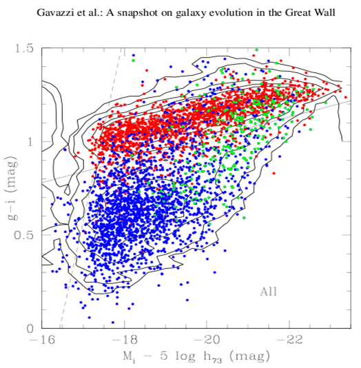
Taken from Fig. 3 of
that paper, the figure shows the "g-i color versus i-band absolute magnitude
relation of all galaxies in the C[oma]S[upercluster] coded according to Hubble type: red = early-
type galaxies (dE-E-S0-S0a); blue = disk galaxies (Sbc-Im-BCD); green = bulge
galaxies (Sa-Sb)... Contours of equal
density are given. The continuum line g-i =
-0.0585 *(Mi + 16) + 0.78 represents the empirical separation between the
red-sequence and the remaining galaxies.
The dashed line illustrates the effect of the limiting magnitude r=17.77 of the
spectroscopic SDSS database, combined with the
color of the faintest E galaxies g-i ~0.70 mag.."
|
Figure 3 from Gavazzi et al (2010) |
Now compare with the Gavazzi CM set the axes to be: x-axis (-16, -23.5), y-axis (0.0, 1.5). Note that when you restrict the scaling, the plot contains 11343 points within the area; we have lost (12469-11343) = 1126 out of 12469 = 9% of the points.